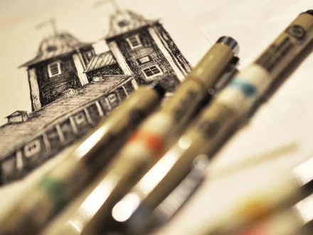
Paintings for Vasa and Korsholm - made by Julia Bäck / Work in progress 1/3
Black and white, hand-drawn, and detailed posters with familiar buildings. Julia Bäck shares about her work in three blog posts. Here is part 1.
Are you already familiar with Julia Bäck's fantastic city paintings? If not, we guarantee you soon will be. In three blog posts, Julia tells us about the work behind the paintings and how the final product came to be. Aveo has the honor of being the exclusive retailer offering her creations for sale, and the paintings are available in Aveo's webshop. The first 20 paintings are hand-signed. Keep an eye out!
WORK IN PROGRESS 1/3
Who am I? Julia Bäck, twenty years old, and can draw really straight lines freehand.
What is this? This is a work in progress post. I am behind some paintings available in Aveo's range, and I will show you how the journey from my sketchbook to Aveo's webshop looked.
I am now talking about two paintings, one concerning Vaasa and one concerning Korsholm. The work on the paintings went back and forth, overlapping and intertwining, but in this post, we focus on the capital of Ostrobothnia - Vaasa.
Brainstorm. That's how most projects start, and this one was no exception. The list of subjects was long, and the six subjects adorning the painting were carefully chosen. Old and new. Typical of Vaasa and less typical of Vaasa. Expected subjects and perhaps some unexpected ones.
Once I knew what to draw, it was just a matter of picking up the pen. Initially, I did nothing but the outlines, first with pencil and then with ink.


Out of pure curiosity, I started timing how long it took to draw the outlines with ink.
"Did you draw from a picture or something?" The compulsory follow-up question when someone saw one of these drawings. Yes. Always. It wouldn't have worked without reference images. Most often, I took the pictures myself, and in a few cases, I relied on Google's selection. However, you rarely get an image you can draw from 100%, an example being the image below where trees obscure parts of the building. I have only one thing to say to you: Google Maps Street View. I've probably found that feature more useful for artistic purposes than for navigation, haha.
In addition to reference images, I also used guidelines. The eye mostly sees what the brain wants it to see. Crooked lines can appear straight because we know the line in question is straight, even if it's crooked from the perspective we see it. The same goes for proportions; we can know that all windows on a building are the same size, but we can't possibly see equally sized windows everywhere at the same time. Straight guidelines help me see what the image actually looks like, not how I think it looks.
I am happy about this project for many reasons, and one of them is definitely the insight into how much beauty Vaasa holds. Big, majestic buildings that I've never looked at more than a moment before. Big, majestic buildings that I now rest my eyes on and appreciate.
The next step - colorless coloring. It's interesting how something that looks so random and thoughtless up close becomes even and neat from a little distance. Therefore, it's good that paintings usually hang on the wall and are viewed from a distance, haha.
A little info that is either self-evident or sounds like Hebrew: everything is done on 200g/m3 paper. For sketches, I mainly used 2H, sometimes 3H or 4H. Ink in seven sizes, from 0.2mm to 0.5mm. All outlines are drawn with 0.35mm.

